Bad UX is expensive
Problem
A deeply flawed user experience on Fidelity PSW was leading to excessive support needs, administrative frustration, and costly accounting errors—placing both client retention and platform profitability in jeopardy.
Solution
I developed a roadmap of what an elevated UX experience would look like, helped our teams rally around a central design codex, and developed patterns that were flexible and adaptive for our varied applications.
Results
We achieved a +10 increase in NPS, earned a 2023 CI Monitor Award for excellence, and reduced support calls and tickets by an estimated 22%.
My Role
Principal UX Designer
Team Size: 12
Principal UX: 2
UX Research: 2
Senior UX Designer: 2
UX Designer: 3
Writer: 1
Project Manager: 2
Principal UX Designer
Team Size: 12
Principal UX: 2
UX Research: 2
Senior UX Designer: 2
UX Designer: 3
Writer: 1
Project Manager: 2
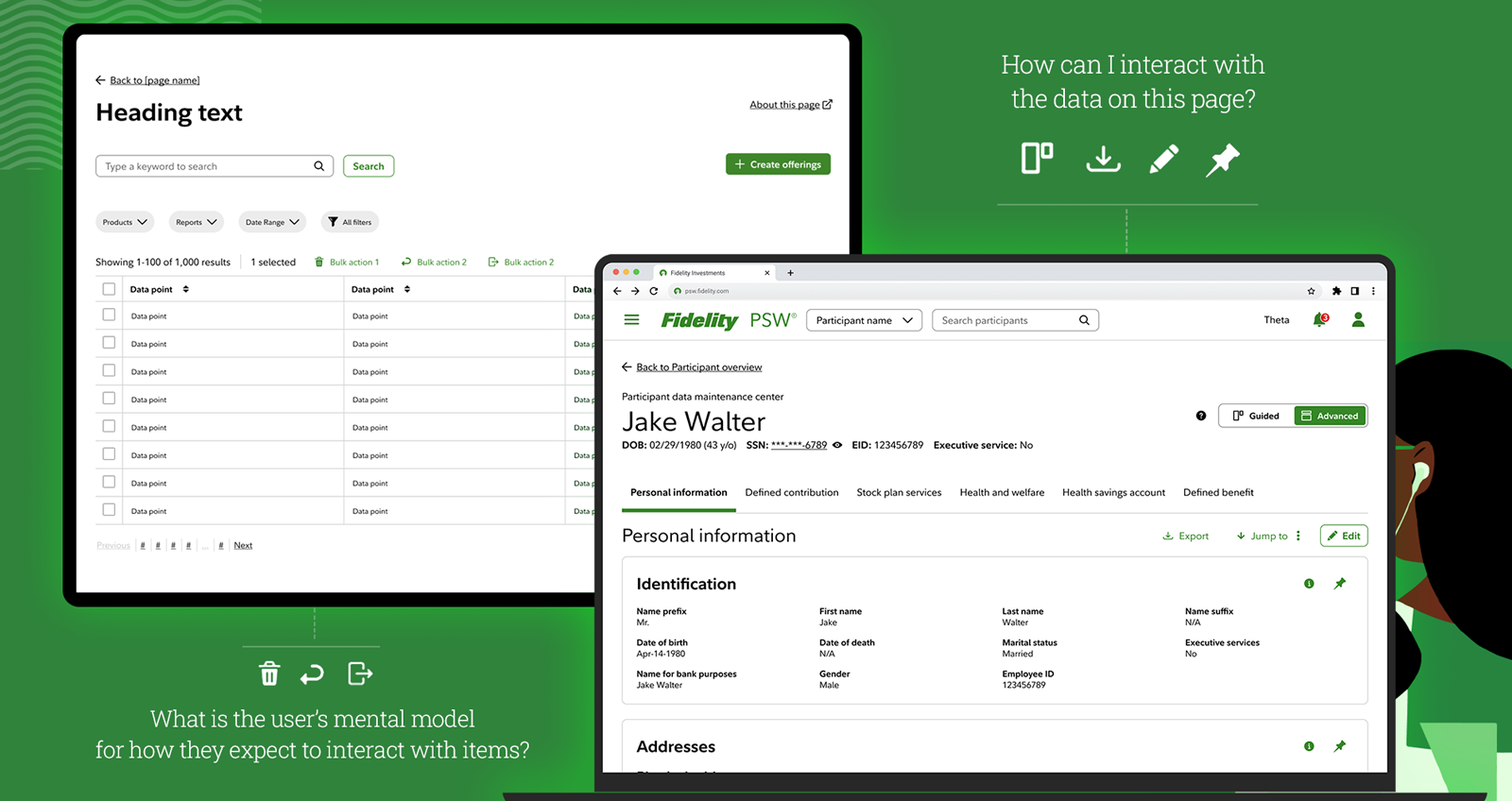
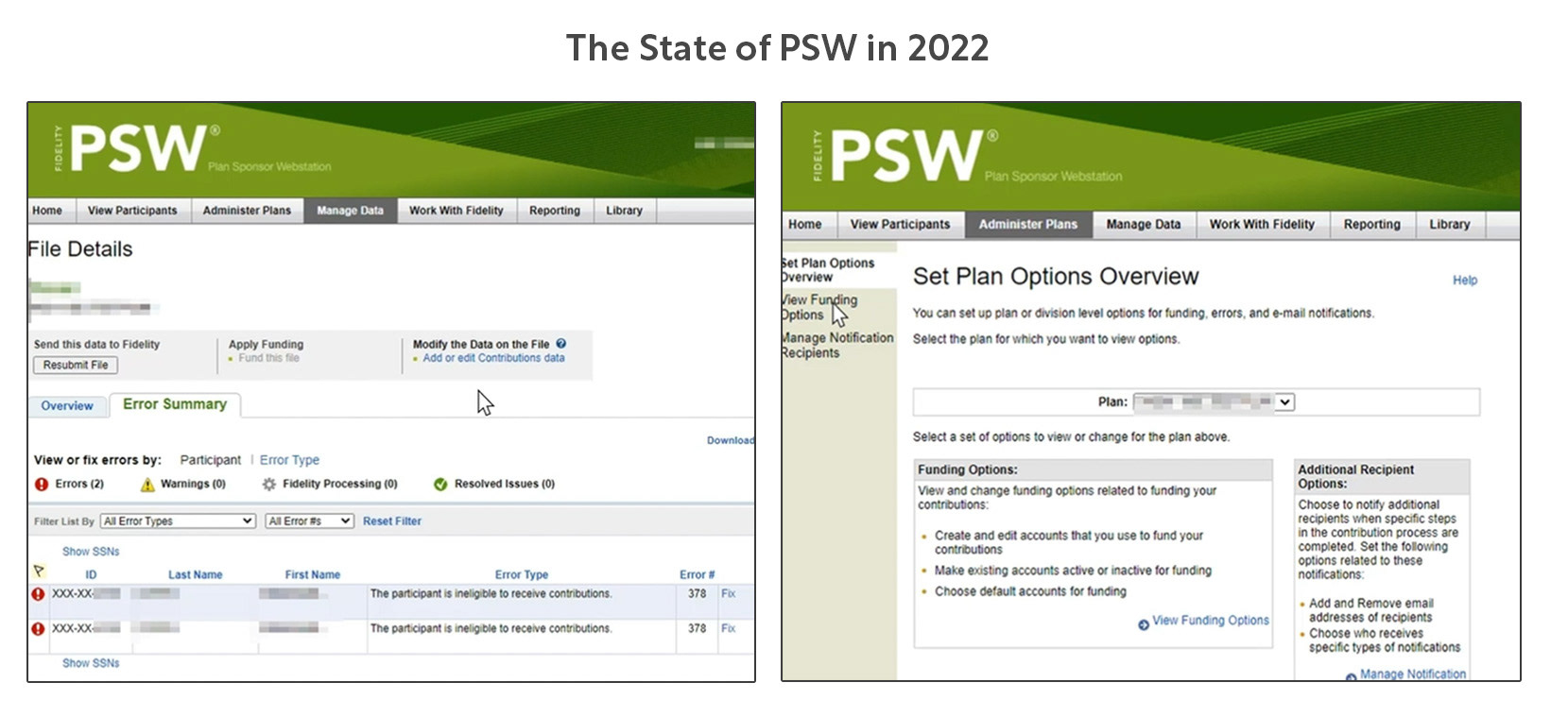
The Problem Explained
PSW is the portal plan sponsors use to manage their Fidelity benefit plans. Large companies like Microsoft may have an entire team of plan sponsors.
In 2022, PSW's three largest business problems were:
1. Phone & Email Support for PSW Are Burning Millions of Dollars
Using PSW is a convoluted and overly complex experience with many nested legacy systems that have never been modernized. While older sponsors have gotten used to the system, most of it is unusable to someone who hasn't been trained on it.
Using PSW is a convoluted and overly complex experience with many nested legacy systems that have never been modernized. While older sponsors have gotten used to the system, most of it is unusable to someone who hasn't been trained on it.
2. Users Find PSW Overly Time Consuming and Frustrating Compared to Other Products They Have Used
Sponsors spend hours trying to understand and use PSW's archaic systems. There is a distinct lack of self-service and many processes require approval by someone at Fidelity. Plan sponsors have become detractors and are actively telling others to avoid our platform.
Sponsors spend hours trying to understand and use PSW's archaic systems. There is a distinct lack of self-service and many processes require approval by someone at Fidelity. Plan sponsors have become detractors and are actively telling others to avoid our platform.
3. Giant Corporations Are Threatening to Leave The Platform
With over 40 million financial clients Fidelity has been able to rest on its laurels for a long time. But as the financial landscape is changing with many new disruptors in the market, Fidelity will have to evolve now or suffer. I personally observed a multi-billion dollar company threaten to leave Fidelity for a more tech-savvy competitor (Vanguard) during my tenure.
With over 40 million financial clients Fidelity has been able to rest on its laurels for a long time. But as the financial landscape is changing with many new disruptors in the market, Fidelity will have to evolve now or suffer. I personally observed a multi-billion dollar company threaten to leave Fidelity for a more tech-savvy competitor (Vanguard) during my tenure.
My Role
I was brought in as a Principal UX Designer to address the systemic UX issues the platform had and lead a vision for the 6 designers and 2 researchers devoted exclusively to PSW.
UX maturity is low on PSW with there being almost no business-side UX consideration. I began to meet regularly with designers, product managers, and cross-functional partners to create a UX Roadmap of what the journey towards maturity would look like. I led UX problem framing sessions, "How Might We" sessions, and feasibility studies with various departments. I knew that getting buy-in from everybody involved was crucial for our UX transformation to be a success.
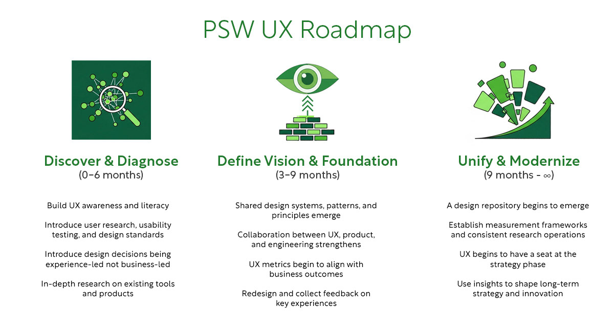
The Plan
Out of these meetings came a solid roadmap:
Discover & Diagnose (0 - 6 months)
Auditing the current experience and working with research to map out the underlying issues sponsors are having
Define Vision & Foundation (3 - 9 months)
Defining a new experience that is scalable, adaptable, and corrects the most common frustrations users are having
Unify & Modernize (9 months - ∞)
Roll out the new experience as we constantly iterate, accept feedback, and work closely with developers to build a living codex / design system
This was not meant to be a "one and done" roadmap but a starting place to look at our business through a UX lens.
Discover & Diagnose (0-6 months)
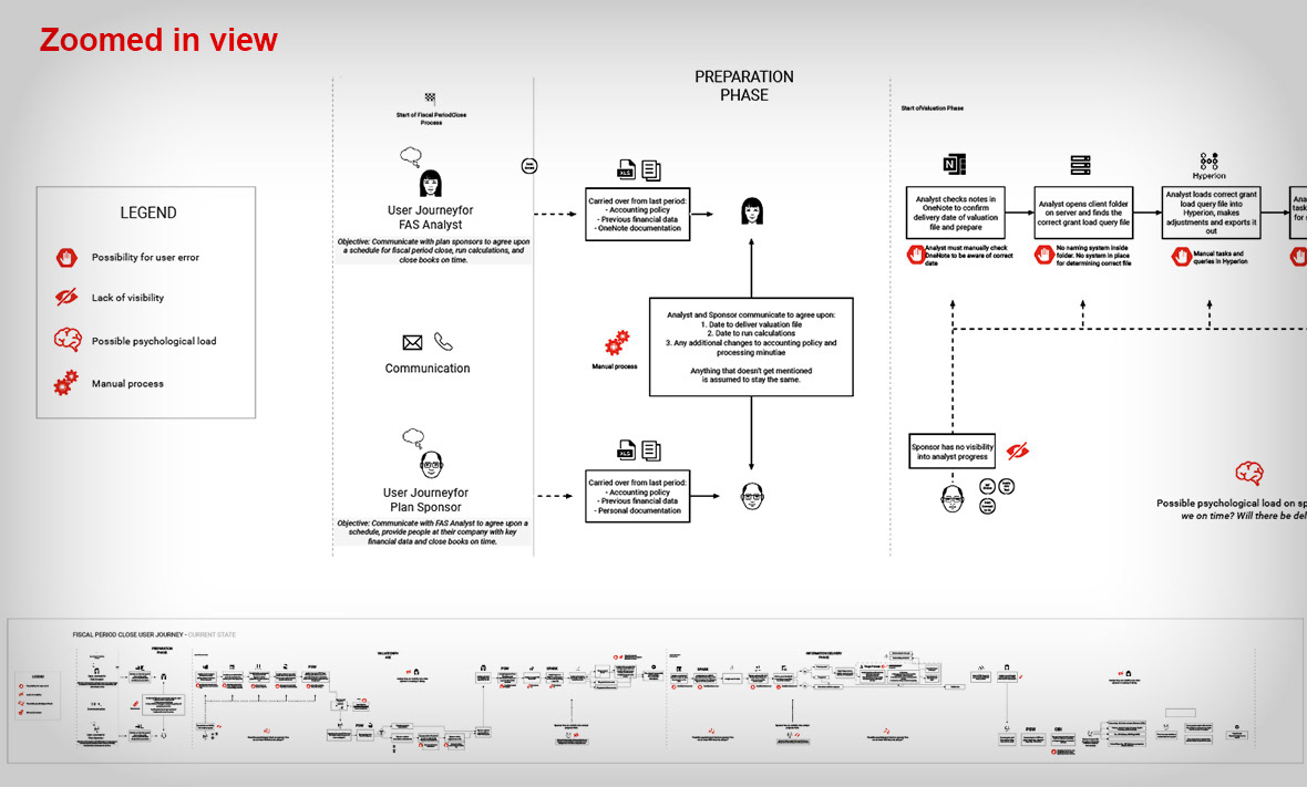
Plan sponsors are notoriously cagey, busy, and don't like to be interviewed, but we were grateful to have a pool of about 20 that would let us interview them.
We embedded teams of one UX researcher with one UX designer per interview and the team would watch a sponsor perform from a list of their job tasks. After each task we would ask them questions. Researchers and designers were required to write a report on each of these interviews and we began to notice patterns both departmental-wide and system-wide.
A Bit of Context
PSW contains around 20 different tools that sponsors use to do their jobs: reporting, retirement contributions, grant documents, etc.
Looking at the design of PSW two things are clear:
(1) Almost all of it was created without considering the user experience
(2) Every tool was built in a vacuum with little concern about what other tools looked like
(1) Almost all of it was created without considering the user experience
(2) Every tool was built in a vacuum with little concern about what other tools looked like
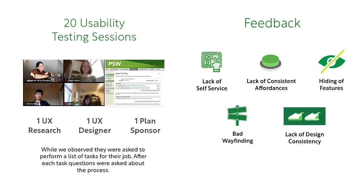
The User Perspective
Speaking to actual plan sponsors, these were the most critical issues from their perspective:
1. Lack of self service: phone & email support required
Many job tasks require contacting Fidelity (and waiting on them) to make an edit.
1. Lack of self service: phone & email support required
Many job tasks require contacting Fidelity (and waiting on them) to make an edit.
2. Hiding of Features
It is a basic UX heuristic that a page's features should be self-evident and clear. Important features are often not prominent enough or hidden by drawers and accordions.
It is a basic UX heuristic that a page's features should be self-evident and clear. Important features are often not prominent enough or hidden by drawers and accordions.
3. Lack of Consistent Affordances
The location of filters, the availability of actions, the color of links, and the method by which you select items on a page varies from experience to experience.
The location of filters, the availability of actions, the color of links, and the method by which you select items on a page varies from experience to experience.
4. Bad wayfinding
The way a user gets around in a workflow often changes from one experience to another.
The way a user gets around in a workflow often changes from one experience to another.
5. Lack of Design Consistency
Users often believe they have gone to a different site because the page designs vary so much from page to page.
Users often believe they have gone to a different site because the page designs vary so much from page to page.
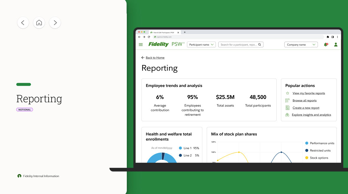
Define Vision & Foundation (0-9 months)
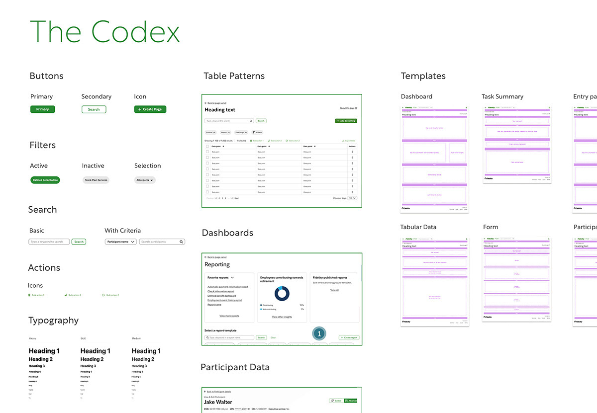
After thoroughly mapping out all existing experiences I worked closely with our UX designers on a plan to begin to solve these problems, naming it The Codex.
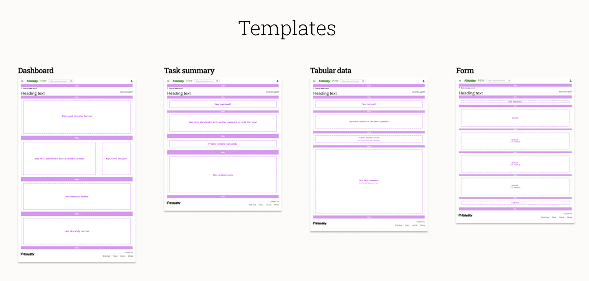
The Codex
A set of flexible and adaptive patterns, components, and templates that will become the building blocks for a better user experience on PSW.
A set of flexible and adaptive patterns, components, and templates that will become the building blocks for a better user experience on PSW.
Filters? We have a pattern for that.
Tables? We have a pattern for that.
Selecting an item and taking an action on it? We have a pattern for that.
Page structure? We have a template for that.
Tables? We have a pattern for that.
Selecting an item and taking an action on it? We have a pattern for that.
Page structure? We have a template for that.
To distinguish here: a pattern is an isolated feature like "filtering" or "page navigation". A template is the bookshelf you place these into.
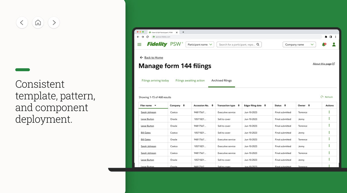
Addressing The Problems
Lets look at three of the larger systemic problems PSW was having and how we addressed these issues by rolling out our templates and patterns.
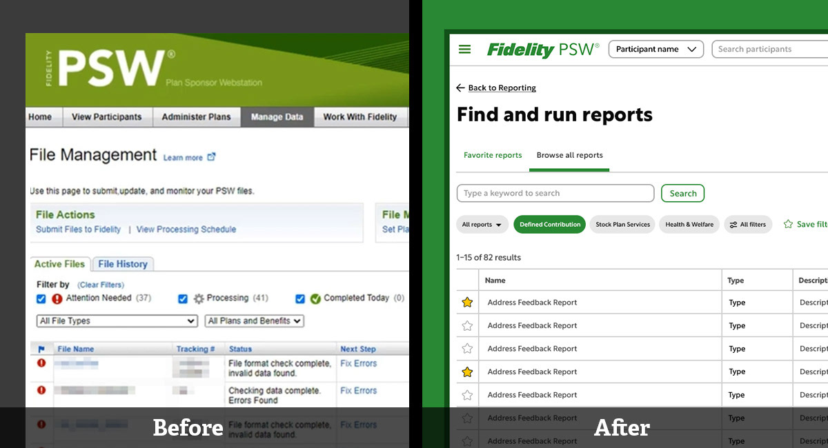
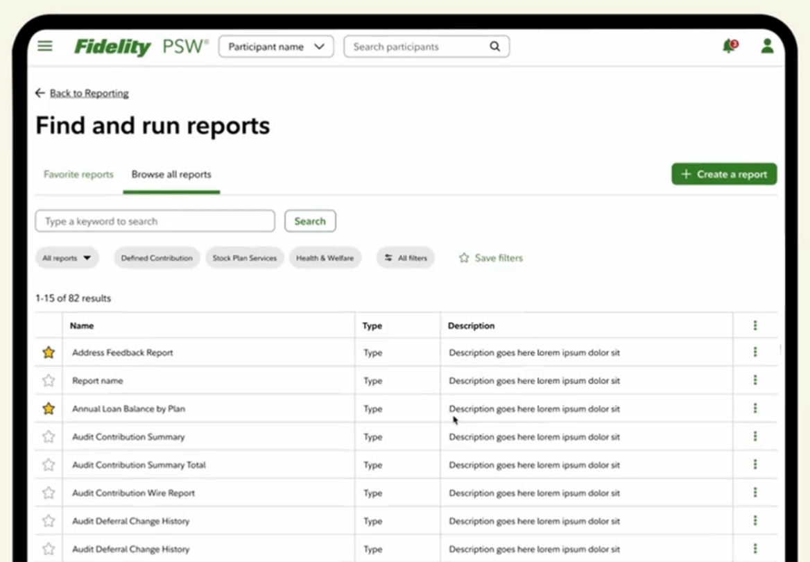
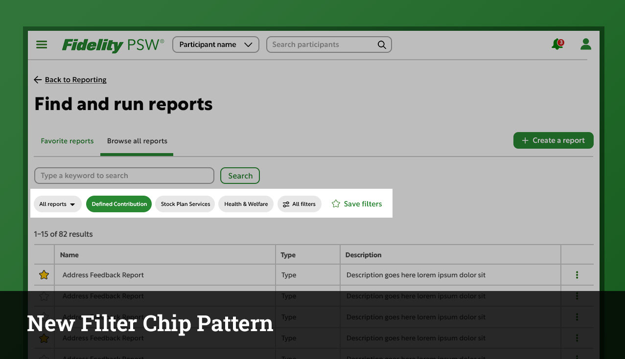
Problem: Inconsistent Data Filtering
Filter controls across experiences have been unclear, inconsistent, and not self-evident.
Problem: Inconsistent Data Filtering
Filter controls across experiences have been unclear, inconsistent, and not self-evident.
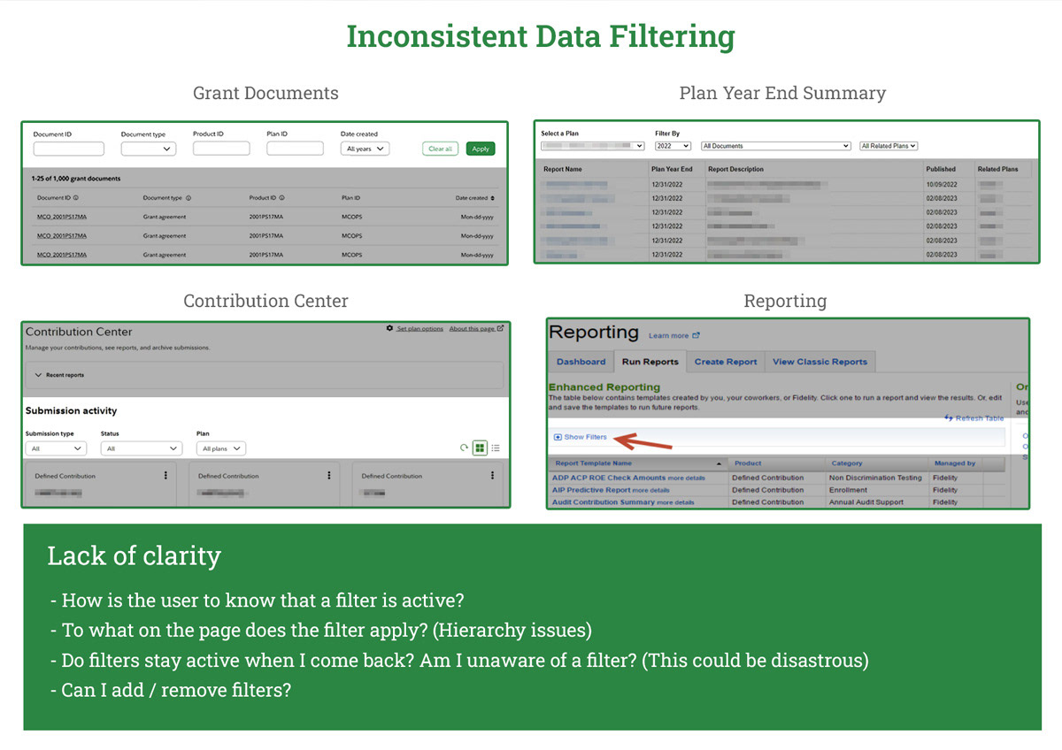
Solution: A unified filtering experience that has been adapted to all use cases
Solution:
- Self-evident
- Very clear when active
- Clear what content the filter applies to
- Clear how to save / reset / and when filter is active
- Same location regardless of experience
Solution:
- Self-evident
- Very clear when active
- Clear what content the filter applies to
- Clear how to save / reset / and when filter is active
- Same location regardless of experience
Problem: Inconsistent Table Patterns
The method of communicating status to a user through a table is varied, inconsistent, and unclear.
The method of communicating status to a user through a table is varied, inconsistent, and unclear.
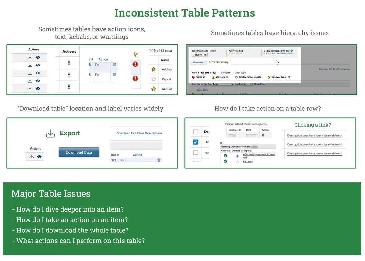
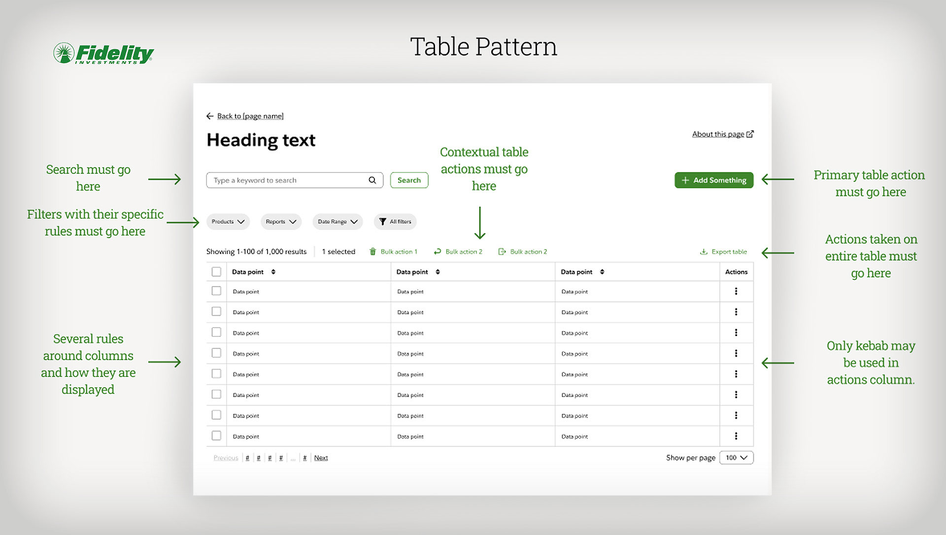
Solution: Architecting a table pattern that works everywhere
Consistent behaviors:
- Selecting one or multiple table rows
- Taking a primary action on a table
- Using a kebab
- Downloading table data
- Filters
- Contextual table actions
Consistent behaviors:
- Selecting one or multiple table rows
- Taking a primary action on a table
- Using a kebab
- Downloading table data
- Filters
- Contextual table actions
Problem: Inconsistent Hiding of Information
Information is often hidden behind inconsistent and varied affordances
Information is often hidden behind inconsistent and varied affordances
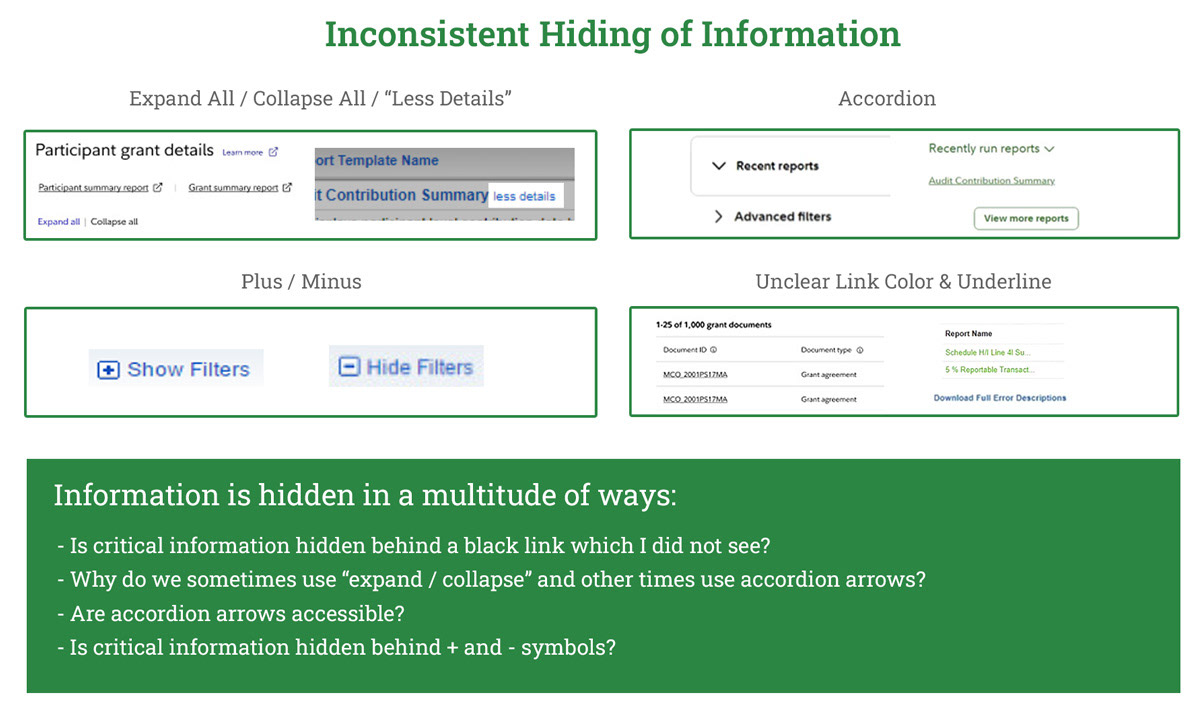
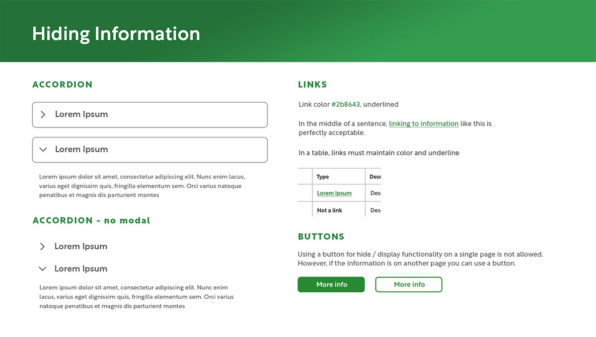
Solution: Standardize the methods for hiding information
Standards:
- Accordion arrow only
- All link colors consistent
- In an edge case, primary and secondary buttons can be used
Standards:
- Accordion arrow only
- All link colors consistent
- In an edge case, primary and secondary buttons can be used
Validating new designs
We validated new designs first by redesigning several core experiences in Figma, turning these into prototypes, and then performing a usability test on the same group of people. In a closed UX interview we saw how they fared performing the exact same job tasks, and the responses were not surprising.
Power User Persona (Age 45 and up)
Experienced users did not take well to the redesign at first but eventually conceded that aspects of it were better and they could get used to it over time:
"Why is there so much white space on the page now?" - Bill
"I don't like buttons being moved. But I could see how I could get used to this over time." - Jennifer
Mid-Level Employee Persona (Age 45 and under)
Less experienced (and younger) users absolutely adored the new design and were excited to see this archaic interface being modernized
"Finally! I love it." - Antwon
"It looks better. Time will tell if the functionality gets better though." - Genevieve
A critical takeaway
Something we had to avoid in creating and updating our codex was the "consistency for consistencies sake" pitfall that I think design systems run into.
Users care about functionality over design. Just because a design is visually consistent throughout doesn't make it a good experience.
Unify & Modernize (9 months - ∞)
As I said earlier our iterative roadmap for UX maturity is not a "one and done" plan but an ever-evolving cycle in which we collect data, hypothesize solutions, test those solutions, and implement them.
"Unify & Modernize" involves taking design elements which have been tested internally and having our development teams build them. Once design elements have been tested on live servers, are being used by thousands of users, and continue to receive positive feedback we will then add these to our pipeline of updates to The Codex.
Our designers can have confidence that anything they pull from The Codex is "battle hardened" and has been tested thousands of times by real users.
Final Outcome
While I had to leave Fidelity due to RTO in January 2025 and only got to see 1.5 "cycles" of our UX maturity roadmap, I left our system in the hands of a very capable team of designers and expect our work to bear fruit.
During my time we achieved a +10 increase in NPS, earned a 2023 CI Monitor Award for excellence, and reduced support calls and tickets by an estimated 22%.
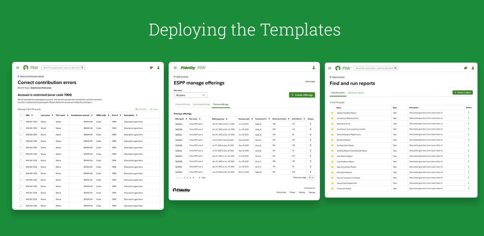
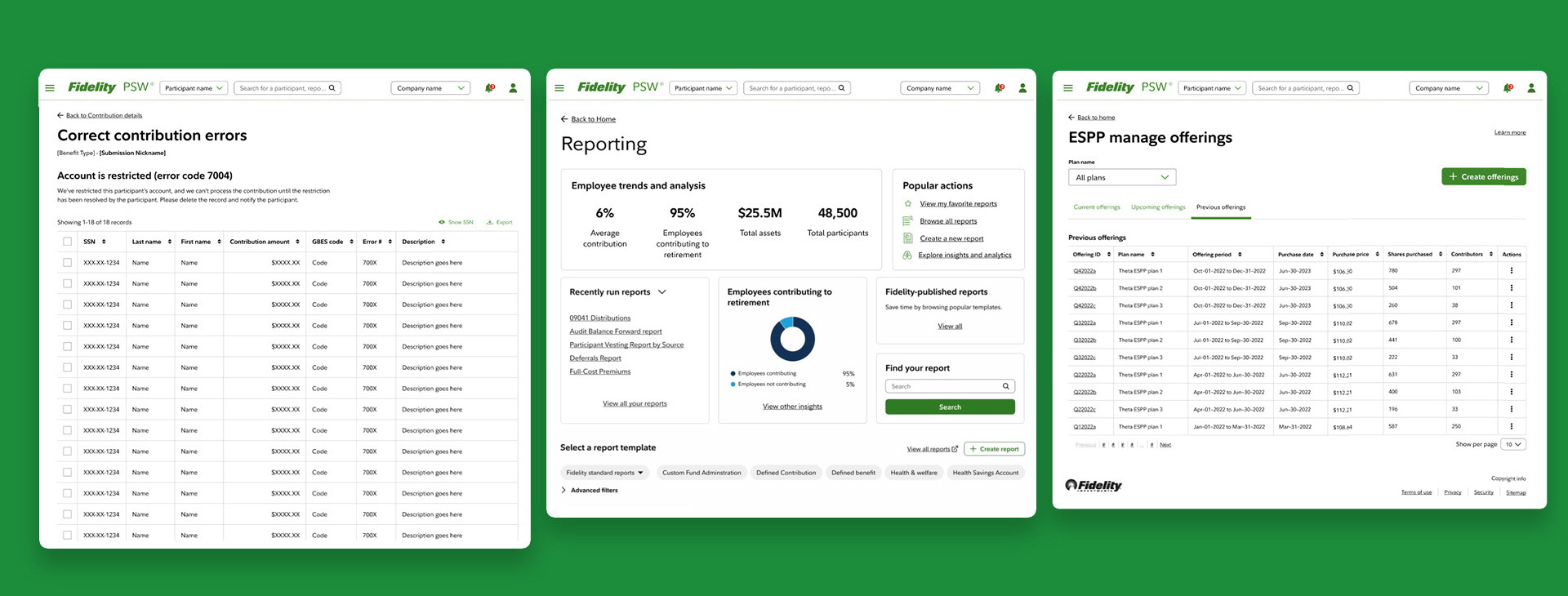
In closing I'll show a few more implementations of our UX roadmap:
During my time we achieved a +10 increase in NPS, earned a 2023 CI Monitor Award for excellence, and reduced support calls and tickets by an estimated 22%.
In closing I'll show a few more implementations of our UX roadmap: